User-Centred Product Creation in Interactive Electronic Publishing
home | events | approach | support | resources | VNET5 project | sitemap1
2
3
4
5
Usability-Test of the mercantile directory "Swissguide"by Daniel Felix, ETH-Z, January 2003 Improving the Usability of www.swissguide.chCablecom in Switzerland wished to improve the Usability of its on-line mercantile directory "Swissguide" (www.swissguide.ch). User centrednes was the prime goal and for this reason a Usability test in the Usability lab of the ETH Zurich was selected to uncover existing problems. The main focus was laid on identifying the problems and finding solutions to eliminate them. The database provided in "Swissguide" contains all registered firms in Switzerland, and the search engine allows the search for all the listed firms, their branch of trade and leading product. Thus the data base could be very useful, however user feedback showed a certain lack of user friendliness or Usability in the search process. Test procedureThe site was tested with 5 subjects in the Usability lab of ergonomie & technologie. Three subjects represented the "user" segment (main task: find a specific firm in the database, find specific details for the firm). Two test subjects represented the "supplier" (main task: find your firm, rectify the entry in the database, take advantage of additional offers by Swissguide). With this procedure both views could be tested, and major problems identified. Results of the Usability testsThe observations were compiled into a list of problems identified. For each problem suggestions for improvement were made. This list would later be used as a checklist for developers when improving the site. The main problems were located in the area of navigation, the representation of buttons (they were hard to recognise as buttons), the categorisation of the products and brands (hard to understand and complex) and the editing of an entry by the firm holding the entry (complicating and not self-evident). In general the portal was not deemed to be fully satisfying and usable. The report and video tapes were subsequently used for a workshop with developers and the management of the "Swissguide" portal. The aim of the workshop was to discuss the findings and to develop specific actions for improvement. At the end of the day it was hoped to have an action list with tasks for all involved, as well as a common understanding of necessary improvements. Improvements made for SwissguideThe decisions taken at the workshop were realised within two month. The improvements were mainly aimed at easier understanding of the search mask and a clearer description of procedures leading to a result. The example screenshots and the descriptions show what had been achieved. ConclusionsThe Usability-Test in the lab provided a sound basis for the discussion of improvements for the search functions on the portal page of "Swissguide". The discussion of the findings allowed a fast identification of problematic areas, and a constructive approach to improvements which could be prioritised and implemented within the given time frame. The workshop not only improve the product, but also strengthened the team of developers and management, as everybody had been involved and was convinced of the decided changes. This success story shows the merits of Usability testing of an existing application. The whole team was convinced after the test that an earlier involvement of Usability issues, or following the development cycle as suggested in by the VNET5 project would have been a better way of proceeding. Future developments and improvements will follow the lines of user centred product creation. 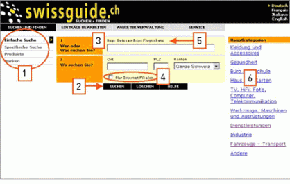
Many changes lead to the strongly improved starting page (see Fig. 2): (1) Search options are clearly perceptible and understandable. Search by keyword and index are separated from the other search strategies.(2) Buttons are placed correctly, are recognised better and are easier to read. (3) The mandatory field is clearly marked with *. (4) The main categories have been replaced with useful tips. 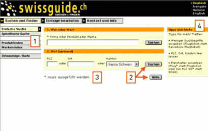
|